Regression discontinuity plots with R (using ggplot2)
Author
Andrés Gutiérrez
Published
November 15, 2014
In public policy evaluation sometimes we use a regression discontinuity analysis in order to estimate the impact of an intervention.
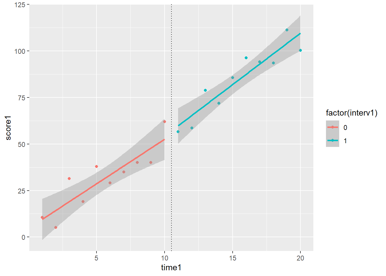
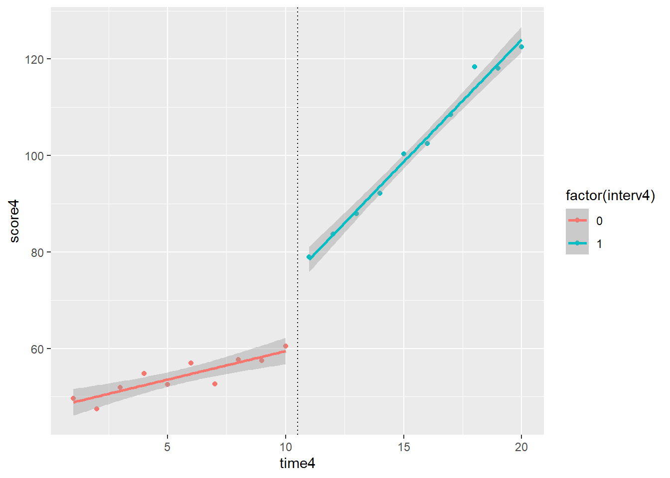
Long story short, we suppose that there is a threshold (real value of a design variable) for which we can divide the population of interest into two groups. So, for those individuals that have values higher than the threshold, a public policy is applied. After the implementation of the policy, we measure the variable of interest for both groups. If the variable of interest has changed its behavior, we can claim that the policy had an impact in the target group.
For those like me who make consulting in public policy, and use R as a default statistical software, the ggplot2 package is a valuable tool in order to visualize the possible changes in the behavior of the variable of interest. I took some scenarios from these slides and created a proper code in ggplot2.