Chapter 4 Analysis of categorical variables
In household survey analysis, one of the most common outputs is the estimation of descriptive parameters associated with categorical variables, which make it possible to summarize the main characteristics of the population. These measures provide a clear and understandable representation of social phenomena based on information collected through probability samples.
The descriptive indicators most commonly used to analyze categorical variables include frequencies and proportions. Frequencies indicate how many people or households belong to each category, for example, the number of people living in poverty, while proportions express the relative weight of each category within the population as a whole.
Although descriptive analysis of categorical variables usually relies on these basic parameters, it is also possible to combine them with measures derived from numerical variables, such as quantiles or inequality indicators, which are discussed in detail in Chapter 4. However, in this chapter we focus exclusively on describing and estimating parameters associated with categorical variables using complex sample designs.
The analysis begins by defining the sampling design, following the guidelines explained in previous chapters and using the same database. This step is essential because it makes it possible to properly incorporate the characteristics of the survey’s complex design, such as expansion factors, primary sampling units, and selection strata. Correctly specifying these elements ensures that the estimates obtained are representative of the target population and that the measures of precision appropriately reflect the variability introduced by the sampling scheme.
library(tidyverse)
library(survey)
library(srvyr)

survey_data <- readRDS("Data/encuesta.rds")
options(survey.lonely.psu = "adjust")

survey_design <- survey_data %>%
  as_survey_design(
    strata = Stratum,
    ids = PSU,
    weights = wk,
    nest = TRUE
  )
Next, several categorical variables derived from the original survey information are generated and used in the exercises developed throughout this chapter. Among them, a variable is constructed to identify whether or not the person is living in poverty. In addition, other categorical variables of analytical interest are also created to support disaggregations and comparisons across different population groups:
survey_design <- survey_design %>%
  mutate(
    poor = ifelse(Poverty != "NotPoor", 1, 0),
    unemployed = ifelse(Employment == "Unemployed", 1, 0),
    age_18 = case_when(
      Age < 18 ~ "< 18 years",
      TRUE ~ ">= 18 years"
    )
  )
The previous code creates new derived variables using the mutate() function from the dplyr package (Wickham, François, et al., 2026). The variables poor and unemployed are constructed with the ifelse() function, which evaluates a logical condition and assigns a value depending on whether the condition is met. In this case, the variables take the value 1 when the person is living in poverty or is unemployed, respectively, and 0 otherwise. The variable age_18, in turn, is generated with the case_when() function, which makes it possible to define categories from one or more conditions more clearly and flexibly than ifelse(). This function is especially useful when categorical variables with multiple levels need to be constructed. In the example, people under 18 years of age are classified in the "< 18 years" category, while the rest are grouped in the ">= 18 years" category.
In addition, it is necessary to generate population subgroups to produce disaggregated estimates. This chapter uses four example subpopulations:
urban_subset <- survey_design %>%
  filter(Zone == "Urban")

rural_subset <- survey_design %>%
  filter(Zone == "Rural")

female_subset <- survey_design %>%
  filter(Sex == "Female")

male_subset <- survey_design %>%
  filter(Sex == "Male")
4.1 Estimation of population size
In household survey analysis, estimating the size of subpopulations is essential. This size is understood as the number of people or households that belong to specific categories and the proportion they represent within the population. These estimates, based on categorical variables, make it possible to characterize the demographic and socioeconomic profile of the population, which is key information for guiding resource allocation, designing public policies, and formulating social programs. For example, estimating how many people are below the poverty line, how many are unemployed, or how many have reached a given educational level is essential for identifying gaps and evaluating well-being conditions.
The size of a population or subpopulation is estimated from categorical variables, which segment the population into mutually exclusive groups (partitions). Population size refers to the total number of individuals or households in the survey database that belong to a given category. These categories may correspond, for example, to employment status or educational attainment. To obtain these estimates, respondents’ answers are combined with the sampling weights, which indicate how many people or households each sample unit represents in the total population.
The population size estimator is defined as:
\[ \hat{N} = \sum_{h} \sum_{i} \sum_{k} w_{hik} \]
Where \(w_{hik}\) is the weight or expansion factor of unit \(k\) in PSU \(i\) of stratum \(h\). Similarly, estimating the size of a subpopulation follows the same principle, but is framed within a subset defined by a specific characteristic. To determine how many people belong to a particular category, that group is identified in the database and its sampling weights are summed. This makes it possible to quantify specific groups of interest and determine their size within the population:
\[ \hat{N}_d = \sum_{h} \sum_{i} \sum_{k} w_{hik} \ I(y_{hik}=d) \]
Where \(I(y_{hik}=d)\) is a binary variable that takes the value 1 if unit \(k\) in PSU \(i\) in stratum \(h\) belongs to category \(d\) of the variable of interest \(y\), and 0 otherwise. Also note that if \(d\) was used in the calibration of the weights, the value of \(\hat{N}_d\) will coincide with the external control applied.
In R, using the sampling design defined previously, it is possible to generate summaries of the survey information for each category of the Zone variable. To do this, the data are grouped by geographic area, which makes it possible to obtain separate results for each of these study domains. This procedure produces two main types of results. First, the number of observations actually collected in the sample is calculated without considering expansion factors, corresponding to the available sample size in each zone. Second, the population size associated with each domain is estimated by incorporating the sampling design information.
Together with the population estimates, measures of precision such as the standard error and confidence interval are also obtained. These make it possible to assess the level of uncertainty associated with the results produced from the sample. The results are presented in Table 4.1. In that table, n represents the number of sample observations in each zone, while size corresponds to the estimated population total of the subpopulation. The unweighted() function is used to calculate unweighted summaries directly from the observed sample data.
survey_design %>%
  group_by(Zone) %>%
  summarise(
    n = unweighted(n()),
    size = survey_total(vartype = c("se", "ci"))
)| Zone | n | size | size_se | size_low | size_upp |
|---|---|---|---|---|---|
| Rural | 1297 | 72102 | 3062 | 66039 | 78165 |
| Urban | 1308 | 78164 | 2847 | 72526 | 83802 |
Indeed, the sample size was 1,297 people in the rural zone and 1,308 in the urban zone. Based on these samples, the population was estimated at 72,102 people for the rural zone, with a standard error of 3,062, and 78,164 people for the urban zone, with a standard error of 2,847. These results reflect not only the estimated population size in each domain, but also the level of precision associated with the estimates obtained from the sampling design.
Using a 95% confidence level, the confidence intervals for the population estimates ranged from 66,038.5 to 78,165.4 people in the rural zone and from 72,526.2 to 83,801.7 people in the urban zone. Similarly, it is also possible to estimate the number of people by different poverty levels; these results are presented in Table 4.2.
| Poverty | size | size_se | size_low | size_upp |
|---|---|---|---|---|
| NotPoor | 91398 | 4395 | 82696 | 100101 |
| Extreme | 21519 | 4949 | 11719 | 31319 |
| Relative | 37349 | 3695 | 30032 | 44666 |
Another relevant categorical variable in household surveys is employment status. The corresponding code is presented below, and its results are shown in Table 4.3. In this case, the information is grouped according to the categories of the Employment variable, making it possible to obtain separate estimates for each labor-force status of the population. Using the group_by() function, estimates can be disaggregated into more detailed levels, facilitating comparative analysis across occupational groups.
Before producing the estimates, records with missing values in the employment variable are excluded, ensuring that the results are calculated only with valid information. Then, for each employment category, population size is estimated using the sampling design defined previously. In addition to the point estimate, measures of precision are also calculated, specifically the standard error and confidence intervals, making it possible to assess the degree of uncertainty associated with each estimate.
survey_design %>%
  filter(!is.na(Employment)) %>%
  group_by(Employment) %>%
summarise(size = survey_total(vartype = c("se", "ci")))| Employment | size | size_se | size_low | size_upp |
|---|---|---|---|---|
| Unemployed | 4635 | 761 | 3129 | 6141 |
| Inactive | 41465 | 2163 | 37183 | 45748 |
| Employed | 61877 | 2540 | 56847 | 66907 |
Based on the results obtained, an estimated 4,634.8 people are unemployed, with a 95% confidence interval between 3,128.6 and 6,140.9 people. Similarly, an estimated 41,465.2 people belong to the inactive population, with a confidence interval between 37,182.6 and 45,747.8. Finally, the employed population was estimated at 61,877.0 people, with a confidence interval from 36,784.2 to 47,793.5 people.
Finally, estimates can also be disaggregated simultaneously by more than one categorical variable. For example, it is possible to analyze employment status by poverty level; the results are presented in Table 4.4. Among other findings, these results show that approximately 44,600.3 employed people are not living in poverty, with a 95% confidence interval between 39,459.6 and 49,741.0 people. Similarly, an estimated 6,421.8 inactive people are living in extreme poverty, with a 95% confidence interval between 3,806.6 and 9,037.0 people.
survey_design %>%
  filter(!is.na(Employment)) %>%
  group_by(Employment, Poverty) %>%
  cascade(
    size = survey_total(vartype = c("se", "ci")),
    .fill = "Total"
)| Employment | Poverty | size | size_se | size_low | size_upp |
|---|---|---|---|---|---|
| Unemployed | NotPoor | 1768 | 405 | 966 | 2571 |
| Unemployed | Extreme | 1169 | 348 | 480 | 1859 |
| Unemployed | Relative | 1697 | 458 | 791 | 2604 |
| Unemployed | Total | 4635 | 761 | 3129 | 6141 |
| Inactive | NotPoor | 24346 | 1736 | 20908 | 27784 |
| Inactive | Extreme | 6422 | 1321 | 3807 | 9037 |
| Inactive | Relative | 10697 | 1460 | 7806 | 13589 |
| Inactive | Total | 41465 | 2163 | 37183 | 45748 |
| Employed | NotPoor | 44600 | 2596 | 39460 | 49741 |
| Employed | Extreme | 5128 | 1122 | 2907 | 7349 |
| Employed | Relative | 12149 | 1347 | 9483 | 14816 |
| Employed | Total | 61877 | 2540 | 56847 | 66907 |
| Total | Total | 107977 | 3466 | 101115 | 114839 |
4.2 Estimation of proportions
Proportions express the relative weight of specific groups within the population. For example, knowing the percentage of households below the poverty line is essential for assessing inequalities and characterizing well-being conditions. To obtain this type of indicator, the weighted mean of the dichotomous variable is calculated, ensuring that the estimate adequately represents the population distribution. According to Heeringa et al. (2017), when the original categories are converted into indicator variables, the estimated proportion is calculated as:
\[ \hat{p}_d = \frac{\hat{N}_d}{\hat{N}} = \frac{\displaystyle\sum_{h} \sum_{i} \sum_{k} w_{hik} \ I(y_{hik}=d)} {\displaystyle\sum_{h} \sum_{i} \sum_{k} w_{hik}} \]
Although this estimator is conceptually simple, it is a nonlinear function of population totals. For this reason, deriving its statistical properties, particularly its variance and standard error, requires approximation methods such as Taylor linearization. In this context, the function \(z_{hik}=I(y_{hik}=d)-\hat{p}_d\) is used. In practice, statistical software implements these procedures automatically and produces proportion estimates together with their corresponding standard errors and confidence intervals.
When proportions take values very close to 0 or 1, the precision of the estimates may be affected, so in many cases larger sample sizes are needed to obtain stable and reliable results. This situation is especially relevant in the analysis of rare or highly concentrated phenomena, where small variations in the sample can produce important changes in the estimates.
In addition, confidence intervals constructed using normal approximations may have lower limits below 0 or upper limits above 1, making them difficult to interpret because they are proportions. To avoid this problem, a widely used alternative is to apply the logit transformation before constructing the confidence intervals. This procedure ensures that, after returning to the original scale, the limits obtained remain within the valid range for proportions.
\[ CI(\hat{p}_d; 1-\alpha) = \frac{exp \left[ln\left(\frac{\hat{p}_d}{1-\hat{p}_d}\right) \pm \frac{\widehat{me}}{\hat{p}_d(1-\hat{p}_d)}\right]}{1 + exp \left[ln\left(\frac{\hat{p}_d}{1-\hat{p}_d}\right) \pm \frac{\widehat{me}}{\hat{p}_d(1-\hat{p}_d)}\right]} \]
Where \(\widehat{me}\) corresponds to the estimated margin of error and is obtained as the product of the critical value from Student’s \(t\) distribution and the estimated standard error of the proportion \(\hat{p}_d\). The term \(t_{1-\alpha/2, df}\) represents the percentile associated with the selected confidence level, considering \(df\) degrees of freedom. In the context of complex surveys, these degrees of freedom are usually defined as the difference between the number of primary sampling units (PSUs) and the number of strata present in the subgroup or analysis domain.
Unlike other statistical software that presents results as percentages, R reports proportions on the [0,1] scale. The functions in these packages make it possible to calculate the estimates, their standard errors, and confidence intervals directly, facilitating the analysis of categorical variables in household surveys. The following example illustrates how to obtain the proportion of people by zone using the sampling design defined previously, presented in Table 4.5:
survey_design %>%
  group_by(Zone) %>%
  summarise(proportion = survey_mean(
    vartype = c("se", "ci"),
    proportion = TRUE
))| Zone | proportion | proportion_se | proportion_low | proportion_upp |
|---|---|---|---|---|
| Rural | 0.48 | 0.014 | 0.452 | 0.508 |
| Urban | 0.52 | 0.014 | 0.492 | 0.548 |
In this example, the survey_mean() function is used to calculate the estimate of population proportions and, through the proportion = TRUE argument, it specifies that the analysis focuses on estimating the relative distribution of the population across the different categories of the variable analyzed. The results indicate that approximately 47.9% of people live in the rural zone, with a 95% confidence interval between 45.2% and 50.7%, while 52.0% corresponds to the population living in the urban zone, with a confidence interval between 49.2% and 54.7%.
The survey library also provides the survey_prop() function, designed specifically for estimating proportions in complex surveys. This function produces results equivalent to those obtained with survey_mean(), while also offering a more direct and intuitive syntax when the objective of the analysis is exclusively to calculate proportions. The results obtained with this alternative are presented in Table 4.6.
These estimates show that, in the urban zone, 53.6% of the population is female, with a 95% confidence interval between 51.0% and 56.2%, while 46.4% is male, with a confidence interval between 43.7% and 48.9%. These results make it possible to examine not only the percentage distribution of the population by sex, but also the level of precision associated with the estimates.
| Zone | proportion | proportion_se | proportion_low | proportion_upp |
|---|---|---|---|---|
| Rural | 0.48 | 0.014 | 0.452 | 0.508 |
| Urban | 0.52 | 0.014 | 0.492 | 0.548 |
If the focus is now on estimating proportions for specific subpopulations, for example, the proportion of men and women living in the urban zone, the analysis must be restricted to that study domain and the corresponding estimates then calculated for each sex category. The corresponding computational code is presented in Table 4.7.
| Sex | proportion | proportion_se | proportion_low | proportion_upp |
|---|---|---|---|---|
| Female | 0.537 | 0.013 | 0.511 | 0.563 |
| Male | 0.463 | 0.013 | 0.437 | 0.489 |
Similarly, the same exercise can be carried out for the population living in the rural zone by estimating the proportion of men and women. This type of disaggregation makes it possible to compare the population composition by sex between urban and rural areas, providing a more detailed view of the demographic characteristics of the surveyed population. The corresponding results are presented in Table 4.8.
rural_subset %>%
  group_by(Sex) %>%
  summarise(
    n = unweighted(n()),
    proportion = survey_prop(vartype = c("se", "ci"))
)| Sex | n | proportion | proportion_se | proportion_low | proportion_upp |
|---|---|---|---|---|---|
| Female | 679 | 0.516 | 0.008 | 0.500 | 0.533 |
| Male | 618 | 0.484 | 0.008 | 0.467 | 0.500 |
Now, if the analysis is restricted only to the male population included in the database and the interest is to estimate the percentage distribution of men by zone of residence, it is possible to calculate the proportion of men living in urban and rural areas using the sampling design defined previously. The corresponding computational code is presented in Table 4.9.
| Zone | proportion | proportion_se | proportion_low | proportion_upp |
|---|---|---|---|---|
| Rural | 0.491 | 0.018 | 0.455 | 0.526 |
| Urban | 0.509 | 0.018 | 0.474 | 0.545 |
If results with several levels of disaggregation are to be estimated, as in previous chapters, the use of the group_by() function makes it possible to generate different aggregation levels by combining two or more categorical variables. For example, it is possible to estimate the proportion of men by zone of residence and poverty status simultaneously. This type of analysis makes it possible to characterize the socioeconomic conditions of specific subpopulations in greater detail. The corresponding procedure is presented in Table 4.10.
male_subset %>%
  group_by(Zone, Poverty) %>%
summarise(proportion = survey_prop(vartype = c("se", "ci")))| Zone | Poverty | proportion | proportion_se | proportion_low | proportion_upp |
|---|---|---|---|---|---|
| Rural | NotPoor | 0.549 | 0.063 | 0.424 | 0.668 |
| Rural | Extreme | 0.198 | 0.067 | 0.096 | 0.364 |
| Rural | Relative | 0.254 | 0.037 | 0.187 | 0.334 |
| Urban | NotPoor | 0.660 | 0.037 | 0.584 | 0.728 |
| Urban | Extreme | 0.113 | 0.025 | 0.073 | 0.171 |
| Urban | Relative | 0.227 | 0.026 | 0.180 | 0.283 |
Based on the results obtained, 19.7% of men in the rural zone are living in extreme poverty, while in the urban zone this proportion is 11.3%. Although the point estimates suggest a higher incidence of extreme poverty in rural areas, comparison of the confidence intervals indicates that there is not enough evidence to conclude that the differences are statistically significant at the confidence level considered, because the two intervals overlap.
It is also possible to categorize quantitative variables to facilitate their joint analysis with other categorical variables. For example, age can be grouped into specific age ranges and then crossed with variables related to employment status. This type of procedure is useful for identifying differences in labor participation across age groups.
Below, the age variable is classified into two categories for the female population: women between 18 and 35 years of age, and women belonging to other age ranges. These categories are then analyzed together with the employability variable, making it possible to estimate the distribution of labor status by age group. The corresponding results are presented in Table 4.11.
female_subset %>%
  filter(!is.na(Employment)) %>%
  mutate(age_range = case_when(
    Age >= 18 & Age <= 35 ~ "18 - 35",
    TRUE ~ "Other"
  )) %>%
  group_by(age_range, Employment) %>%
summarise(proportion = survey_prop(vartype = c("se", "ci")))| age_range | Employment | proportion | proportion_se | proportion_low | proportion_upp |
|---|---|---|---|---|---|
| 18 - 35 | Unemployed | 0.029 | 0.009 | 0.015 | 0.054 |
| 18 - 35 | Inactive | 0.517 | 0.038 | 0.442 | 0.591 |
| 18 - 35 | Employed | 0.455 | 0.036 | 0.385 | 0.526 |
| Other | Unemployed | 0.016 | 0.007 | 0.007 | 0.036 |
| Other | Inactive | 0.571 | 0.030 | 0.511 | 0.629 |
| Other | Employed | 0.413 | 0.029 | 0.356 | 0.472 |
4.3 Contrasts and differences in proportions
According to Heeringa et al. (2017), the proportions obtained in the rows of a two-way table can be interpreted as estimates for different subpopulations, defined from the levels of a categorical variable. In this context, it is relevant not only to estimate the proportions associated with each group, but also to evaluate the differences between them using linear contrasts.
For example, suppose the interest is in comparing the proportion of women living in poverty with the proportion of men in the same situation. Formally, this contrast can be expressed as \(\hat{p}_F - \hat{p}_M\), where \(\hat{p}_F\) represents the estimated proportion of women in poverty and \(\hat{p}_M\) the estimated proportion of men in that condition. To construct this contrast, the proportions of men and women in poverty are first estimated using the same procedure described in previous chapters. The corresponding results are presented in Table 4.12:
sex_poverty_proportion <- survey_design %>%
  group_by(Sex) %>%
  summarise(proportion = survey_mean(poor,
                                     na.rm = TRUE,
                                     vartype = c("se", "ci")))

sex_poverty_contrast <- svyby(
  formula = ~poor,
  by = ~Sex,
  design = survey_design,
  FUN = svymean,
  na.rm = TRUE,
  covmat = TRUE,
  vartype = c("se", "ci")
)| Sex | proportion | proportion_se | proportion_low | proportion_upp |
|---|---|---|---|---|
| Female | 0.389 | 0.032 | 0.327 | 0.452 |
| Male | 0.395 | 0.037 | 0.322 | 0.467 |
Once the proportions of men and women living in poverty have been estimated, it is possible to calculate the difference between the two proportions together with its corresponding standard error. In this case, the estimated difference is obtained by subtracting the proportion of men in poverty from the proportion of women in the same condition:
## [1] -0.0054To correctly calculate the variability associated with this difference, it is not enough to consider only the variances of each estimate separately. It is also necessary to incorporate the covariance between the two proportions, since the estimates come from the same sample and therefore are not independent. The variance-covariance matrix can be obtained with the vcov function; the results are presented in Table 4.13:
| Female | Male | |
|---|---|---|
| Female | 0.000998 | 0.000918 |
| Male | 0.000918 | 0.001342 |
Based on this matrix, the standard error of the difference in proportions is estimated using the general expression for the variance of a difference between estimators, which corresponds to the sum of the variances of each estimate minus twice the covariance between them. In this case, the calculation is carried out as follows:
## [1] 0.0224However, the survey package makes it possible to carry out this procedure directly using the svycontrast function, which calculates both the linear contrast and its associated standard error. To obtain the difference between the proportions of women and men living in poverty, the following code is used:
svycontrast(
  stat = sex_poverty_contrast,
  contrasts = list(sex_difference = c(1, -1))
) %>%
  data.frame()
## contrast sex_difference
## sex_difference -0.00532 0.0224From this, it is concluded that the difference between the proportions of women and men living in poverty is -0.005 (-0.5%), with a standard error of 0.022, indicating that the estimated proportion of women living in poverty is slightly lower than that observed among men.
Another exercise that can be developed from a household survey consists of estimating the proportion of unemployed people by region of residence. To do this, unemployment proportions are estimated for each of the regions considered in the analysis. The results obtained are presented in Table 4.14:
region_unemployment_proportion <- survey_design %>%
  filter(!is.na(unemployed)) %>%
  group_by(Region) %>%
  summarise(proportion = survey_mean(unemployed,
                                     na.rm = TRUE,
                                     vartype = c("se", "ci")))

region_unemployment_contrast <- svyby(
  formula = ~unemployed,
  by = ~Region,
  design = survey_design %>%
    filter(!is.na(unemployed)),
  FUN = svymean,
  na.rm = TRUE,
  covmat = TRUE,
  vartype = c("se", "ci")
)| Region | proportion | proportion_se | proportion_low | proportion_upp |
|---|---|---|---|---|
| Norte | 0.049 | 0.020 | 0.009 | 0.088 |
| Sur | 0.066 | 0.024 | 0.019 | 0.113 |
| Centro | 0.039 | 0.012 | 0.014 | 0.063 |
| Occidente | 0.040 | 0.012 | 0.016 | 0.064 |
| Oriente | 0.030 | 0.013 | 0.005 | 0.054 |
Once the unemployment proportions by region have been estimated, the next step is to evaluate whether there are statistically significant differences between some of these proportions using linear contrasts. In particular, the interest is in comparing the differences between the estimated unemployment proportions of different regions. The contrasts considered are \(\hat{p}_{North} - \hat{p}_{Center} = 0.01004\), \(\hat{p}_{South} - \hat{p}_{Center} = 0.02691\), and \(\hat{p}_{West} - \hat{p}_{East} = 0.01046\). In matrix form, these regional contrasts can be written as follows:
\[ \left[\begin{array}{ccccc} 1 & 0 & -1 & 0 & 0\\ 0 & 1 & -1 & 0 & 0\\ 0 & 0 & 0 & 1 & -1 \end{array}\right] \]
To calculate the standard errors associated with each of the previous contrasts, it is necessary to consider not only the variances of the regional estimates, but also the covariances between them. This information is summarized in the variance-covariance matrix of the estimated unemployment proportions by region, presented below:
| Norte | Sur | Centro | Occidente | Oriente | |
|---|---|---|---|---|---|
| Norte | 0.000401 | 0.000000 | 0.000000 | 0.000000 | 0.000000 |
| Sur | 0.000000 | 0.000564 | 0.000000 | 0.000000 | 0.000000 |
| Centro | 0.000000 | 0.000000 | 0.000154 | 0.000000 | 0.000000 |
| Occidente | 0.000000 | 0.000000 | 0.000000 | 0.000151 | 0.000000 |
| Oriente | 0.000000 | 0.000000 | 0.000000 | 0.000000 | 0.000158 |
Note that the covariances between the regional estimates are equal to zero because the samples selected in each region are independent of one another. Therefore, the standard error of each contrast is obtained by applying the variance expression for the difference between two estimators. In this case, the calculation reduces to the square root of the sum of the corresponding variances:
## [1] 0.0236## [1] 0.0268## [1] 0.0176Alternatively, the survey package allows these contrasts to be calculated directly using the svycontrast function, which obtains both the estimated differences between proportions and their respective standard errors. In this case, the contrasts defined above are estimated as follows:
svycontrast(
  stat = region_unemployment_contrast,
  contrasts = list(
    north_center = c(1, 0, -1, 0, 0),
    south_center = c(0, 1, -1, 0, 0),
    west_east = c(0, 0, 0, 1, -1)
  )
) %>%
  data.frame()
## contrast SE
## north_center 0.0100 0.0236
## south_center 0.0269 0.0268
## west_east 0.0105 0.01764.4 Cross-tabulations
In addition to analyzing each variable individually, it is especially relevant to study whether there is an association between two categorical variables. This type of analysis makes it possible to identify patterns and relationships that provide valuable information for decision-making and for understanding social phenomena. For example, in the field of public policy, education and employment can be related to design labor-market strategies; in the evaluation of social programs, differences in access to health services can be analyzed by income level; and in social research, demographic variables and living conditions can be studied together to understand population dynamics and trends.
Formally, let \(x\) and \(y\) be two categorical variables with \(R\) row categories and \(C\) column categories, respectively. In the context of sample surveys, the interest usually focuses on estimating the joint distribution of both variables, that is, the proportion of population units that simultaneously belong to each possible combination of categories. To do this, the entries of a cross-tabulation, also known as a contingency table, are estimated using weighted frequencies obtained from the expansion factors and the sampling design. The estimate of the population total associated with each cell \((r,c)\) is defined as:
\[ \hat{N}_{rc} = \sum_{h} \sum_{i} \sum_{k} w_{hik} \ I(x_{hik}=r,\ y_{hik}=c), \]
where \(w_{hik}\) represents the expansion factor associated with element \(k\) of PSU \(i\) belonging to stratum \(h\), while \(I(x_{hik}=r,\ y_{hik}=c)\) corresponds to an indicator function that takes the value one when the observed unit simultaneously belongs to category \(r\) of variable \(x\) and category \(c\) of variable \(y\), and takes the value zero in any other case.
In addition to joint frequencies, it is also possible to estimate marginal sizes by rows and columns, defined respectively as \(\hat{N}_{r+} = \sum_{c=1}^{C} \hat{N}_{rc}\) and \(\hat{N}_{+c} = \sum_{r=1}^{R} \hat{N}_{rc}\). The grand total is expressed as \(\hat{N}_{++} = \sum_{r=1}^{R}\sum_{c=1}^{C} \hat{N}_{rc}\). The general structure of a contingency table with \(R\) rows and \(C\) columns can be represented as follows:
| Variable 2 | Variable 1 | \(\cdots\) | Row marginal | ||
|---|---|---|---|---|---|
| \(1\) | \(2\) | \(\cdots\) | \(C\) | ||
| \(1\) | \(\hat{N}_{11}\) | \(\hat{N}_{12}\) | \(\cdots\) | \(\hat{N}_{1C}\) | \(\hat{N}_{1+}\) |
| \(2\) | \(\hat{N}_{21}\) | \(\hat{N}_{22}\) | \(\cdots\) | \(\hat{N}_{2C}\) | \(\hat{N}_{2+}\) |
| \(\vdots\) | \(\vdots\) | \(\vdots\) | \(\ddots\) | \(\vdots\) | \(\vdots\) |
| \(R\) | \(\hat{N}_{R1}\) | \(\hat{N}_{R2}\) | \(\cdots\) | \(\hat{N}_{RC}\) | \(\hat{N}_{R+}\) |
| Column marginal | \(\hat{N}_{+1}\) | \(\hat{N}_{+2}\) | \(\cdots\) | \(\hat{N}_{+C}\) | \(\hat{N}_{++}\) |
Traditionally, contingency tables are usually represented as two-dimensional arrays of dimension \(R \times C\). However, they can also be extended to incorporate one or more additional variables, generating subsets or subtables that make it possible to study more complex relationships between categorical variables. Based on the estimated sizes, proportions can also be estimated for each cell of the contingency table as follows:
\[ \hat{p}_{rc}=\frac{\hat{N}_{rc}}{\hat{N}_{++}} \]
Next, continuing with the example database, the percentage distribution of men and women by poverty status is estimated, also incorporating their respective standard errors and confidence intervals. The results are presented in Table 4.16. This type of analysis makes it possible to describe the composition of the poor population by sex and evaluate the precision of the estimates obtained from the sampling design.
poverty_design <- survey_design %>%
  mutate(poor = factor(
    poor,
    levels = 0:1,
    labels = c("Not poor", "Poor")
  ))
poverty_design %>%
group_by(poor, Sex) %>%
summarise(proportion = survey_prop(vartype = c("se", "ci")))| poor | Sex | proportion | proportion_se | proportion_low | proportion_upp |
|---|---|---|---|---|---|
| Not poor | Female | 0.529 | 0.012 | 0.505 | 0.554 |
| Not poor | Male | 0.471 | 0.012 | 0.446 | 0.495 |
| Poor | Female | 0.524 | 0.016 | 0.492 | 0.555 |
| Poor | Male | 0.476 | 0.016 | 0.445 | 0.508 |
The results indicate that 52.3% of the population living in poverty is female, while 47.6% is male. For women, the 95% confidence interval is between 49.2% and 55.5%, while the corresponding interval for men is between 44.5% and 50.7%. These estimates make it possible to observe the relative distribution of poverty by sex, while also considering the uncertainty inherent in the sampling process.
Using the same srvyr approach, the contingency table can also be estimated with group_by() and summarise(). The following example estimates the distribution of poverty status by sex, also obtaining measures of precision such as standard errors and confidence intervals. The corresponding code and results are presented in Table 4.17.
sex_by_poverty_proportion <- poverty_design %>%
  group_by(poor, Sex) %>%
summarise(proportion = survey_prop(vartype = c("se", "ci")))| poor | Sex | proportion | proportion_se | proportion_low | proportion_upp |
|---|---|---|---|---|---|
| Not poor | Female | 0.529 | 0.012 | 0.505 | 0.554 |
| Not poor | Male | 0.471 | 0.012 | 0.446 | 0.495 |
| Poor | Female | 0.524 | 0.016 | 0.492 | 0.555 |
| Poor | Male | 0.476 | 0.016 | 0.445 | 0.508 |
In addition, confidence intervals can be obtained using the confint() function, which automatically calculates the lower and upper limits associated with the estimates produced. The procedure for estimating the confidence intervals is presented in Table 4.18. Note that the intervals coincide with those generated previously using the group_by function.
| poor | Sex | proportion_low | proportion_upp |
|---|---|---|---|
| Not poor | Female | 0.505 | 0.554 |
| Not poor | Male | 0.446 | 0.495 |
| Poor | Female | 0.492 | 0.555 |
| Poor | Male | 0.445 | 0.508 |
Another analysis of interest related to two-way tables in household surveys consists of estimating the percentage of unemployed people by sex. The corresponding procedure and results are presented in Table 4.19.
sex_by_employment_proportion <- survey_design %>%
  filter(!is.na(Employment)) %>%
  group_by(Employment, Sex) %>%
summarise(proportion = survey_prop(vartype = c("se", "ci")))| Employment | Sex | proportion | proportion_se | proportion_low | proportion_upp |
|---|---|---|---|---|---|
| Unemployed | Female | 0.273 | 0.054 | 0.180 | 0.390 |
| Unemployed | Male | 0.727 | 0.054 | 0.610 | 0.820 |
| Inactive | Female | 0.770 | 0.023 | 0.721 | 0.813 |
| Inactive | Male | 0.230 | 0.023 | 0.187 | 0.279 |
| Employed | Female | 0.405 | 0.019 | 0.369 | 0.442 |
| Employed | Male | 0.595 | 0.019 | 0.558 | 0.631 |
From the previous output, it can be observed that 27.2% of women and 72.7% of men are unemployed, with standard errors for these estimates of 5.3% for both women and men. The corresponding confidence intervals are calculated below and presented in Table 4.20:
| Employment | Sex | proportion_low | proportion_upp |
|---|---|---|---|
| Unemployed | Female | 0.180 | 0.390 |
| Unemployed | Male | 0.610 | 0.820 |
| Inactive | Female | 0.721 | 0.813 |
| Inactive | Male | 0.187 | 0.279 |
| Employed | Female | 0.369 | 0.442 |
| Employed | Male | 0.558 | 0.631 |
If the objective is now to estimate poverty by region, the numeric variable poor is used within an srvyr workflow, as shown in Table 4.21.
region_poverty_proportion <- survey_design %>%
  group_by(Region, poor) %>%
summarise(proportion = survey_prop(vartype = c("se", "ci")))| Region | poor | proportion | proportion_se | proportion_low | proportion_upp |
|---|---|---|---|---|---|
| Norte | 0 | 0.641 | 0.055 | 0.526 | 0.742 |
| Norte | 1 | 0.359 | 0.055 | 0.258 | 0.474 |
| Sur | 0 | 0.656 | 0.043 | 0.566 | 0.737 |
| Sur | 1 | 0.344 | 0.043 | 0.263 | 0.434 |
| Centro | 0 | 0.635 | 0.079 | 0.470 | 0.773 |
| Centro | 1 | 0.365 | 0.079 | 0.227 | 0.530 |
| Occidente | 0 | 0.599 | 0.047 | 0.504 | 0.687 |
| Occidente | 1 | 0.401 | 0.047 | 0.313 | 0.496 |
| Oriente | 0 | 0.548 | 0.088 | 0.374 | 0.711 |
| Oriente | 1 | 0.452 | 0.088 | 0.289 | 0.626 |
From the above, it can be concluded that in the North region, 35% of people are living in poverty, while in the South the figure is 34%. The highest poverty level is found in the East region, with 45% of people living in poverty. The standard errors of the estimates.
4.5 The odds ratio
The odds ratio is a widely used measure for studying the association between two categorical variables, especially when the interest is in comparing the probability of an event occurring across different population groups. Its interpretation is based on comparing the relative odds of an event occurring between two analysis categories.
In this sense, this parameter makes it possible to evaluate how those odds change across different groups of interest and is a fundamental tool in social, economic, and health studies. In addition, this measure can also be used to quantify the relationship between the levels of a variable and a categorical factor by comparing the relative odds of the event occurring in each group (Heeringa et al., 2017).
For example, suppose the aim is to study the association between people’s sex and poverty status. In particular, the interest is in evaluating whether the relative odds of belonging to the non-poor group versus the poor group differ between women and men. To do this, the following odds ratio can be defined:
\[ \frac{ P(\text{Sex}=\text{Female} \mid \text{pobreza}=0) \big/ P(\text{Sex}=\text{Female} \mid \text{pobreza}=1) }{ P(\text{Sex}=\text{Male} \mid \text{pobreza}=1) \big/ P(\text{Sex}=\text{Male} \mid \text{pobreza}=0) } \]
The numerator expression represents the relative odds of observing women not living in poverty relative to observing women living in poverty. Analogously, the denominator represents the relative odds of observing men living in poverty relative to men not living in poverty. Therefore, the odds ratio compares both relative odds and makes it possible to quantify whether the association between sex and poverty favors one group more than the other.
A value equal to one would indicate the absence of association between the variables, that is, that the relationship between sex and poverty status is similar for men and women. Values greater than one would indicate greater relative odds for women compared with men, while values below one would suggest greater relative odds for men. In the context of household surveys, this type of measure is especially useful for studying sociodemographic inequalities and gaps in well-being conditions across different population groups.
The procedure for carrying this out in R is first to estimate the proportions of the cross-tabulation between the sex and poverty variables, presented in Table 4.22:
sex_poverty_interaction_proportion <- survey_design %>%
  group_by(Sex, poor) %>%
  summarise(proportion = survey_prop(vartype = c("se", "ci")))

sex_poverty_odds_contrast <- svymean(x = ~interaction(Sex, poor),
                                     design = survey_design,
                                     se = TRUE, na.rm = TRUE, ci = TRUE,
keep.vars = TRUE)| Sex | poor | proportion | proportion_se | proportion_low | proportion_upp |
|---|---|---|---|---|---|
| Female | 0 | 0.611 | 0.032 | 0.547 | 0.671 |
| Female | 1 | 0.389 | 0.032 | 0.329 | 0.453 |
| Male | 0 | 0.605 | 0.037 | 0.531 | 0.675 |
| Male | 1 | 0.395 | 0.037 | 0.325 | 0.469 |
Then, the contrast is performed by dividing each of the elements of the expression shown above:
odds_ratio <- quote(
 (`interaction(Sex, poor)Female.0` /
  `interaction(Sex, poor)Female.1`) /
 (`interaction(Sex, poor)Male.0` /
  `interaction(Sex, poor)Male.1`)
)

svycontrast(
  stat = sex_poverty_odds_contrast,
  contrasts = odds_ratio
)
## nlcon SE
## contrast 1.02 0.1The result is that the estimated odds that a woman is not living in poverty, compared with a man, is equal to 1.02. This means that, without considering other survey variables, women have odds of not being in poverty that are approximately 2% higher than those observed among men. In other words, the relative probability of not living in poverty is slightly higher for women than for men.
4.6 \(\chi^{2}\) test of independence
As introduced in previous chapters, a hypothesis test is a statistical procedure used to evaluate whether the evidence observed in a sample is compatible with a statement about the population. In the context of contingency tables, tests of independence make it possible to analyze whether there is an association between two categorical variables.
In this case, the null hypothesis (\(H_{0}\)) states that both variables are independent; that is, the distribution of one variable does not depend on the categories of the other. Under this assumption, the differences observed in the sample are attributed only to sampling variability and not to a real relationship between the variables in the population. Mathematically, this hypothesis can be expressed as:
\[ H_0: p_{rc}^0 = p_{r+} \times p_{+c}, \quad \text{para todo } r = 1,\ldots,R \text{ y } c = 1,\ldots,C \]
Where \(p_{rc}^0\) represents the expected proportion in cell \((r,c)\) under the assumption of independence, while \(P_{r+}\) and \(P_{+c}\) correspond to the row and column marginal proportions, respectively. Under this formulation, the independence hypothesis implies that the joint probability of each cell can be expressed as the product of its marginal probabilities.
Consequently, the test of independence consists of comparing the observed or estimated proportions \(\hat{p}_{rc}\) with the expected proportions \(p_{rc}^0\) under the null hypothesis. When the differences between them are small, the empirical evidence is consistent with the assumption of independence. Conversely, sufficiently large discrepancies suggest the existence of an association between the variables and lead to rejection of \(H_0\).
As noted previously, in household surveys, features of the complex sampling design, such as stratification, cluster selection, and the use of expansion factors, affect the variability of the estimators compared with what would be obtained under simple random sampling. As a result, Pearson’s classical \(\chi^2\) test of independence is not appropriate for analyzing contingency tables from this type of design, because it may underestimate or overestimate the real variability of the estimates.
To correct this problem, Fay (1979) and Fellegi (1980) proposed the first adjustments to Pearson’s chi-square statistic based on the generalized design effect (\(GDEFF\)). Later, Rao & Scott (1984) and Thomas & Rao (1987) expanded and formalized the theoretical framework for these corrections, giving rise to what is now known as the Rao-Scott test, considered the reference procedure for analyzing categorical data obtained from complex surveys.
The central idea of this approach is to adapt the classical test of independence by incorporating the generalized design effect, thereby obtaining a statistic that is robust to the complexities of the sampling design:
\[ \chi_{RS}^2 = \frac{n_{++}}{GDEFF} \sum_r \sum_c \frac{(\hat{p}_{rc} - p_{rc}^0)^2}{p_{rc}^0} \]
where \(n_{++}\) represents the total sample size, \(\hat{p}_{rc}\) corresponds to the estimated proportion in cell \((r,c)\) of the contingency table, and \(p_{rc}^0\) denotes the expected proportion under the null hypothesis of independence, calculated from the product of the row and column marginal proportions.
The term \(GDEFF\) (Heeringa et al., 2017) represents the generalized design effect and measures how much the variability of the estimates increases or decreases as a consequence of the complex survey design relative to the variability that would be observed under simple random sampling. In this way, the Rao–Scott adjustment allows the inferences derived from the test of independence to adequately reflect the structure of the sampling design.
Under the null hypothesis \(H_0\), the statistic \(\chi_{RS}^2\) approximately follows a \(\chi^2\) distribution with \((R-1)(C-1)\) degrees of freedom, where \(R\) and \(C\) correspond to the number of row and column categories, respectively. In situations with small samples or few degrees of freedom, adjustments based on the \(F\) distribution are often used because they improve the precision of statistical inference. Rao-Scott tests are currently the standard for analyzing association between categorical variables in complex surveys (Heeringa et al., 2017).
The survey package in R implements this type of test through the svychisq() function, which automatically incorporates the Rao-Scott adjustments to account for the characteristics of the complex sampling design. This function makes it possible to evaluate the existence of association between two categorical variables using weighted contingency tables and properly correcting the variability of the estimators. As an example, to evaluate whether poverty status is independent of sex, the following code is run:
##
##  Pearson's X^2: Rao & Scott adjustment
##
## data:  NextMethod()
## F = 0.06, ndf = 1, ddf = 119, p-value = 0.8
In this case, the formula argument specifies the two categorical variables whose independence is to be evaluated; design corresponds to the sampling design defined previously; and statistic = "F" indicates that the test will be carried out using the adjusted version based on the \(F\) distribution. If the p-value is greater than 5%, the null hypothesis \(H_0\) is not rejected, leading to the conclusion that there is not enough statistical evidence to state that poverty and sex are associated. Conversely, if the p-value is less than 5%, \(H_0\) is rejected, suggesting the existence of dependence or association between the two categorical variables. Other relationships can be evaluated in the same way, such as unemployment and sex or poverty and region.
##
##  Pearson's X^2: Rao & Scott adjustment
##
## data:  NextMethod()
## F = 62, ndf = 2, ddf = 201, p-value <0.0000000000000002
In this first case, for the test of independence between the variables Sex and Employment, the statistic obtained was \(F = 62.251\), with a p-value less than \(2.2\times10^{-16}\), providing statistically significant evidence to reject the null hypothesis of independence between the two variables. Consequently, the results suggest that there is a significant association between sex and employment status in the study population.
##
##  Pearson's X^2: Rao & Scott adjustment
##
## data:  NextMethod()
## F = 0.5, ndf = 3, ddf = 358, p-value = 0.7
On the other hand, this test of independence between the variables Region and poor produces \(F = 0.48794\), with a p-value of \(0.6914\). Because this p-value is considerably greater than conventional significance levels, there is not enough evidence to reject the null hypothesis of independence. Therefore, the results suggest that, under the sampling design considered, no statistically significant association is observed between region and poverty status.
4.7 Visualization of categorical variables
The visualization of categorical variables is fundamental in household survey analysis because it makes it possible to clearly communicate the distribution of population groups and the comparisons between them. As in the analysis of continuous variables, graphs must incorporate sampling weights so that the visual representation corresponds to valid population-level estimates. When statistical precision is relevant, it is advisable to accompany bars with confidence intervals, which communicate both the central value and the uncertainty associated with the estimation process.
This section uses the ggplot2 package (Wickham, Chang, et al., 2026).
4.7.1 Bar charts
Constructing bar charts in R requires, as a prior step, obtaining the estimates to be represented visually. In the context of complex surveys, these estimates can be calculated using the survey_total() or survey_prop() functions from the srvyr package, depending on whether the interest is in population totals or proportions.
This procedure is illustrated below using the estimated population size by zone of residence. The corresponding graphical results are presented in Figure 4.1:
zone_size <- survey_design %>%
  group_by(Zone) %>%
  summarise(size = survey_total(vartype = c("se", "ci")))

zone_colors <- c(Urban = "#48C9B0", Rural = "#117864")

ggplot(
  data = zone_size,
  aes(
    x = Zone, y = size,
    ymax = size_upp, ymin = size_low,
    fill = Zone
  )
) +
  geom_bar(stat = "identity", position = "dodge") +
  geom_errorbar(position = position_dodge(width = 0.9), width = 0.3) +
  scale_fill_manual(values = zone_colors) +
  theme_bw() +
  theme(legend.position = "top")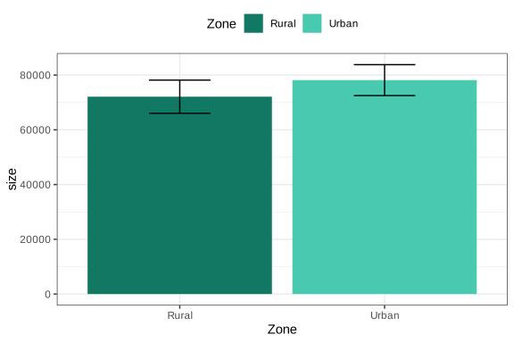
Figure 4.1: Bar chart of population size by geographic zone
The previous procedure can also be applied to variables with more than two categories. In these cases, the bar chart makes it easy to compare the estimates associated with each category of the variable of interest. For example, the estimated distribution of the population by poverty status is presented below, with the graphical results shown in Figure 4.2.
poverty_size <- survey_design %>%
  group_by(Poverty) %>%
  summarise(size = survey_total(vartype = c("se", "ci")))

ggplot(
  data = poverty_size,
  aes(
    x = Poverty, y = size,
    ymax = size_upp, ymin = size_low,
    fill = Poverty
  )
) +
  geom_bar(stat = "identity", position = "dodge") +
  geom_errorbar(position = position_dodge(width = 0.9), width = 0.3) +
  theme_bw() +
  theme(legend.position = "top")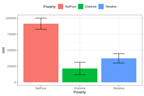
Figure 4.2: Bar chart of population size by poverty status
One advantage of bar charts is that they can easily be extended to comparisons between two categorical variables. For example, population size by poverty level crossed with employment status can be analyzed, as presented in Figure 4.3:
employment_poverty_size <- survey_design %>%
  group_by(unemployed, Poverty) %>%
  summarise(size = survey_total(vartype = c("se", "ci"))) %>%
  as.data.frame() %>%
  mutate(
    unemployed = case_when(
      unemployed == 0 ~ "Occupied",
      unemployed == 1 ~ "Unemployed",
      is.na(unemployed) ~ "Not in the Labour Force"
    )
  )

ggplot(
  data = employment_poverty_size,
  aes(
    x = Poverty, y = size,
    ymax = size_upp, ymin = size_low,
    fill = as.factor(unemployed)
  )
) +
  geom_bar(stat = "identity", position = "dodge") +
  geom_errorbar(position = position_dodge(width = 0.9), width = 0.3) +
  theme_bw() +
  theme(legend.position = "top")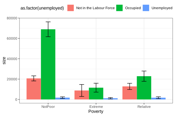
Figure 4.3: Bar chart of population size by employment status and poverty
This type of graphical analysis is especially useful for identifying intersections of vulnerability by showing two or more population characteristics simultaneously. It is also possible to present proportions instead of counts. For example, the proportion of men living in poverty by zone is presented in Figure 4.4:
male_zone_poverty_proportion <- male_subset %>%
  group_by(Zone, Poverty) %>%
  summarise(proportion = survey_prop(vartype = c("se", "ci")))

ggplot(
  data = male_zone_poverty_proportion,
  aes(
    x = Poverty, y = proportion,
    ymax = proportion_upp, ymin = proportion_low,
    fill = Zone
  )
) +
  geom_bar(stat = "identity", position = "dodge") +
  geom_errorbar(position = position_dodge(width = 0.9), width = 0.3) +
  scale_fill_manual(values = zone_colors) +
  theme_bw() +
  theme(legend.position = "top")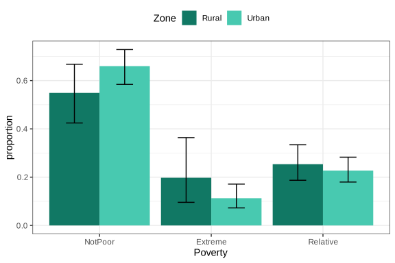
Figure 4.4: Proportion of men living in poverty by geographic zone
Similarly, the proportion of men living in poverty disaggregated by region can be graphed, as presented in Figure 4.5:
male_region_poverty_proportion <- male_subset %>%
  group_by(Region, poor) %>%
  summarise(proportion = survey_prop(vartype = c("se", "ci"))) %>%
  data.frame()

ggplot(
  data = male_region_poverty_proportion,
  aes(
    x = Region, y = proportion,
    ymax = proportion_upp, ymin = proportion_low,
    fill = as.factor(poor)
  )
) +
  geom_bar(stat = "identity", position = "dodge") +
  geom_errorbar(position = position_dodge(width = 0.9), width = 0.3) +
  theme_bw() +
  theme(legend.position = "top")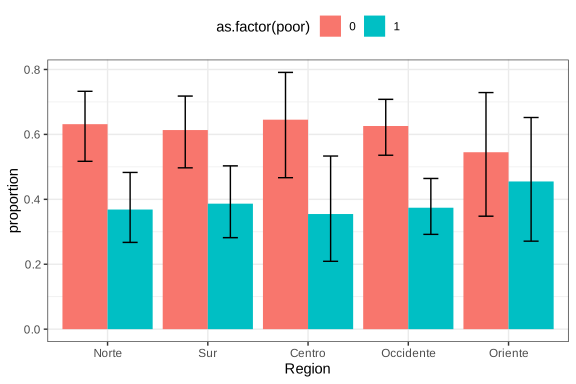
Figure 4.5: Proportion of men living in poverty by region
In summary, bar charts together with their corresponding standard errors provide a clear description of poverty, employment, or other categorical-variable patterns in the population and, when applied correctly, are a powerful tool for communicating findings from household surveys while maintaining statistical rigor in the representation of results.
4.7.2 Maps
Thematic maps are an especially useful visualization tool in household survey analysis because they make it possible to represent the territorial distribution of social and demographic indicators. In this context, the proportion estimates calculated in previous sections, such as the percentage of poverty or unemployment by region, can be projected directly onto geographic units, thereby facilitating the identification of spatial patterns and regional inequalities.
To build this type of map in R, geospatial information in shapefile format is required, containing the polygons associated with each geographic unit of analysis. This chapter uses the file bigcity_shape/BigCity.shp, whose regions correspond to those defined in the BigCity database. The sf (Pebesma et al., 2026) and tmap (Tennekes, 2026) packages make it possible to load, manipulate, and visualize this geographic information in an integrated way with the results obtained from the survey.
The following code loads the packages needed to work with geospatial information and cartographic visualization in R. First, the sf library makes it possible to read and manipulate modern spatial objects, while tmap provides tools for creating thematic maps. The instruction tmap_mode("plot") sets the maps to static visualization mode, which is appropriate for documents and reports. Finally, the read_sf() function imports the geographic file BigCity.shp, storing it in the shapeBigCity object, which contains the polygons corresponding to the analysis regions.
library(sf)
library(tmap)
tmap_mode("plot")
bigcity_shape <- read_sf("Data/shapeBigCity/BigCity.shp")
With the shapefile loaded, a map of the regions can be generated using tm_shape() and tm_polygons(), as shown in Figure 4.6:
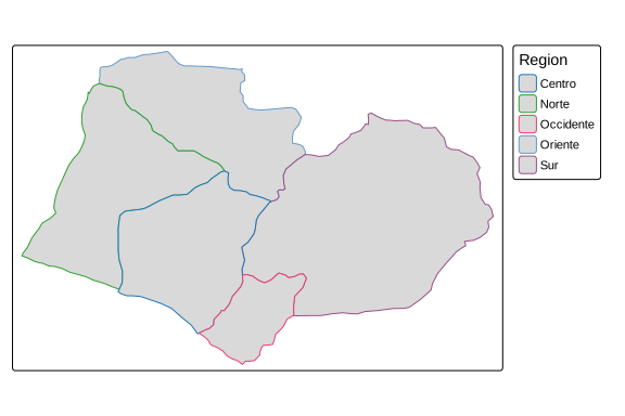
Figure 4.6: Map of BigCity geographic regions
For example, if the aim is to geographically represent the proportion of men living in poverty by region, estimated previously in Figure 4.5, the estimates obtained must be integrated with the spatial information from the shapefile. To do this, the male_region_poverty_proportion object, which contains the estimated proportions for each region, is linked to the geographic file using the left_join() function. Then, only the observations corresponding to the poverty category (poor == 1) are filtered, so that the map exclusively represents the spatial distribution of the male population living in poverty.
shape_region_map <- tm_shape(
  bigcity_shape %>%
    left_join(
      male_region_poverty_proportion %>%
        filter(poor == 1),
      by = "Region"
    )
)
Once the spatial object with the estimates of interest has been built, the breaks argument helps define the cut points that determine the intervals of the color scale used in the map. The thematic map is then generated, making it possible to visualize the regional distribution of the proportion of men living in poverty, as presented in Figure 4.7.
poverty_breaks <- c(0, 0.2, 0.4, 0.6, 0.8, 1)
shape_region_map +
  tm_polygons(
    col = "proportion",
    breaks = poverty_breaks,
    title = "Poverty proportion",
    palette = "YlOrRd"
  )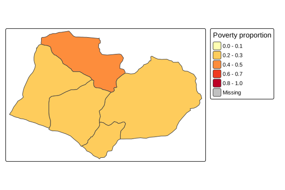
Figure 4.7: Proportion of men living in poverty by region
Another use of maps in surveys is the visualization of estimate precision. For example, using the coefficient of variation of mean income by region makes it possible to identify areas where the estimates are less reliable, as shown in Figure 4.8.
The following code calculates and geographically represents the coefficient of variation of mean income by region. First, the function estimates average income for each region. The vartype = "cv" argument requests calculation of the coefficient of variation for each estimate. The classification intervals of the color scale are then defined using the cv_breaks object, and the estimates are integrated with the geographic information from the shapefile using left_join(). Finally, using the tm_shape() and tm_polygons() functions from the tmap package, the map is constructed to spatially represent the coefficients of variation using a black-and-white color scale and adjusting the map aspect ratio with tm_layout(asp = 0).
region_mean <- survey_design %>%
  group_by(Region) %>%
  summarise(mean = survey_mean(Income,
                               na.rm = TRUE,
                               vartype = c("cv")))

cv_breaks <- c(0, 0.1, 0.2, 1)
shape_cv_map <- tm_shape(
  bigcity_shape %>%
    left_join(region_mean, by = "Region")
)

shape_cv_map +
  tm_polygons(
    "mean_cv",
    breaks = cv_breaks,
    title = "Mean income CV",
    palette = c("#FFFFFF", "#000000")
  ) +
  tm_layout(asp = 0)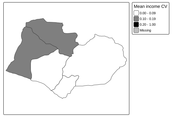
Figure 4.8: Coefficient of variation of mean income by region
Polygons with darker shades correspond to regions where the income estimate has greater relative variability, which may indicate insufficient sample sizes to obtain precise estimates in those areas.
When two variables are to be represented simultaneously, for example, the poverty proportion and its coefficient of variation, it is possible to build a bivariate map using ggplot2 together with the biscale (Prener et al., 2025) and cowplot (Wilke, 2025) packages. This type of visualization makes it possible to jointly identify regions with high poverty and high estimation uncertainty, as presented in Figure 4.9. The following code estimates the proportion of women living in poverty in rural zones for each region, also incorporating calculation of the coefficient of variation of the estimates, thereby generating a database ready for constructing a bivariate map.
region_sex_poverty_proportion <- survey_design %>%
  group_by(Region, Zone, Sex, poor) %>%
  summarise(proportion = survey_mean(vartype = "cv")) %>%
  filter(poor == 1, Zone == "Rural", Sex == "Female")
The following code constructs a bivariate map that makes it possible to simultaneously visualize the rural female poverty proportion and the coefficient of variation associated with that estimate by region. First, the estimates contained in region_sex_poverty_proportion are integrated with the geographic information from the shapefile using left_join(). Then, using the bi_class() function from the biscale package, the variables proportion and proportion_cv are jointly classified into a \(3 \times 3\) grid of categories (dim = 3), using Fisher’s classification method (style = "fisher"). Next, with ggplot2 and geom_sf(), the thematic map is generated using bivariate colors defined by bi_scale_fill(), while bi_theme() applies a minimalist style and the default legend is removed.
Next, the bi_legend() function creates a specialized legend that makes it possible to interpret both dimensions of the map simultaneously: the coefficient of variation and rural female poverty. Finally, using the ggdraw() and draw_plot() functions from the cowplot package, the map and legend are combined into a single visualization.
library(biscale)
library(cowplot)

bivariate_shape <- bigcity_shape %>%
  left_join(region_sex_poverty_proportion, by = "Region")

k <- 3
bivariate_data <- bi_class(
  bivariate_shape,
  y = proportion,
  x = proportion_cv,
  dim = k,
  style = "fisher"
)

bivariate_map <- ggplot() +
  geom_sf(
    data = bivariate_data,
    aes(fill = bi_class, geometry = geometry),
    colour = "white",
    size = 0.1
  ) +
  bi_scale_fill(pal = "GrPink", dim = k) +
  bi_theme() +
  theme(legend.position = "none")

bivariate_legend <- bi_legend(
  pal = "GrPink",
  dim = k,
  xlab = "Coefficient of variation",
  ylab = "Rural female poverty",
  size = 8
)

ggdraw() +
  draw_plot(bivariate_map, 0, 0, 1, scale = 0.7) +
  draw_plot(bivariate_legend, 0.75, 0.4, 0.2, 0.2)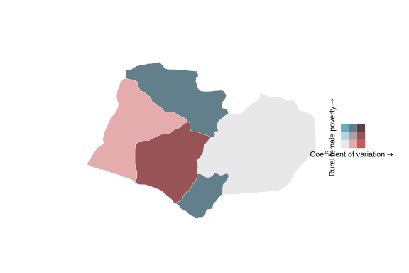
Figure 4.9: Bivariate map: rural female poverty proportion and its coefficient of variation by region
In this map, each cell of the legend combines a shade of the poverty proportion (vertical axis) with a shade of the coefficient of variation (horizontal axis), making it possible to simultaneously identify regions with high poverty and high estimation uncertainty. This type of representation is especially valuable for guiding decisions about the need to increase sample size in specific geographic areas.